
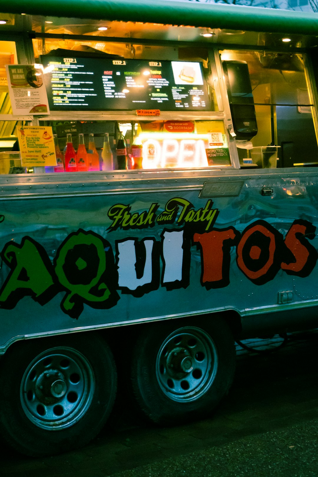
In the booming world of mobile cuisine, where first impressions are everything, a well-designed logo can make all the difference. Whether you’re operating from a vintage food truck in downtown LA or a sleek pop-up kitchen at a weekend market, your logo is more than just a design—it’s your identity. Smart, appealing visual branding reflects your culinary vision and builds trust with your customers.
TLDR:
If you’re launching a food truck or pop-up kitchen, your logo is critical in establishing your brand identity. A good logo should communicate your cuisine style, attract your target audience, and remain flexible across various formats—from signs to packaging. This article presents 12 food truck and pop-up kitchen logo ideas to inspire your brand design. Each suggestion is rooted in proven visual strategies to help distinguish your mobile kitchen in a competitive market.
1. Minimalist Food Icon
Sometimes less is more. A minimalist logo featuring a simple icon—like a single chili pepper, burger silhouette, or chef hat—paired with clean typography can create a timeless brand. This approach works especially well for gourmet or upscale street food businesses aiming for a sleek and modern aesthetic.
2. Retro Diner Style
Tap into the nostalgic comfort of 1950s Americana by adopting classic diner-style logo elements. Think bold script fonts, neon color palettes, shiny chrome borders, and maybe a stylized food truck illustration. This type of design is perfect for trucks selling burgers, shakes, and fries.
Pro tip: Pair your retro look with authentic menu items to ensure your branding feels cohesive rather than gimmicky.
3. Geometric Typography
Strong geometric fonts paired with synchronized shapes or frames give your logo authority and structure. This style works for urban pop-up kitchens with industrial design elements. Use bold sans-serif lettering to evoke modernity, and introduce angular food symbols like triangles (pizza slices) or squares (waffles).
4. Hand-Drawn Signature Style
Handwritten or brush-style typography evokes a personal, artisanal vibe. Complement this with sketch-style illustrations of food items, utensils, or even the truck itself. This style resonates with organic, made-from-scratch, or farm-to-table vendors and builds a human connection right from the first glance.
Use when: You want your audience to associate your food with authenticity and craftsmanship.
5. Bold Monograms
If your food truck or pop-up kitchen has a strong brand name—say, “Benny & Sons” or “TK Tacos”—consider a bold monogram. Letters like “B&S” or “TK” can stand alone as iconic visual elements. This design option is versatile and can be integrated into aprons, containers, or even social media avatars seamlessly.
6. Ethnic Pattern Integration
Highlight your cultural heritage by integrating patterns or design motifs from your cuisine’s region of origin. For example, a taqueria might use Aztec-patterned borders, or a Korean BBQ truck could incorporate minimal hanbok color schemes or Hangul calligraphy.
Design tip: Choose authenticity over stereotypes. This adds depth to your visual identity and honors the culture you’re representing.
7. Cartoon Mascots
This playful approach involves creating a character or food mascot—think of an illustrated taco with sunglasses or a cheerful ramen bowl. These logos appeal to families and younger demographics, often becoming memorable branding anchors over time.
8. Street Art or Graffiti-Style
Channel the urban energy of your location with graffiti-inspired designs. Spray-paint-style lettering, wall textures, bold color overlays, and even stencil art can make your truck feel like a part of the city’s creative fabric. It’s an excellent fit for fusion food and edgy culinary concepts.
Appropriate for: Urban taco trucks, Asian fusion spots, and anything with a bold, experimental menu.
9. Vintage Stamp Logos
Stamped logos with letterpress textures give off an old-world charm, suggesting tradition and reliability. These work especially well for slow-cooked BBQ or rustic European food. Use brown, beige, or earth tones with serif fonts to complete the effect.
10. Food-in-Motion Design
Convey the dynamic nature of your mobile business with motion-themed design elements. Swirls around a pizza, flames dancing around a skewer, or even speed lines on a sandwich hint that your food is made fast and fresh—with flair. It’s ideal for energetic and youthful brands.
11. Typographic Illustrations
Take a clever approach by designing food icons that form from clever typography. For example, the “O” in your name could double as a donut or a pizza. This integrated method communicates playfulness and creative thinking—perfect for inventive kitchens and fusion menus.
12. Monochrome Icons with Strong Contrast
Using high-contrast black and white elements (or a single-color palette) is powerful in both digital and print. It looks sharp on chalkboard menus, napkins, vehicle wraps, and even websites. This logo type has dramatic impact and makes your brand instantly recognizable, especially from a distance.
Example: A black silhouette of a wok emitting rising steam in white, set beside bold sans-serif text. Simple, but effective.
Tips to Finalize Your Logo Design
- Test visibility: Your logo must be legible from afar—especially if it’s going on the side of a moving truck. Prioritize bold shapes and avoid overly detailed graphics.
- Keep it scalable: The design should look good on both a 3-inch sticker and a 10-foot banner. Check it in grayscale too.
- Reflect your food: Your logo must tell customers what you serve, or at least hint at it. Mismatched aesthetics confuse and alienate potential diners.
- Consult with a professional: If you can afford it, think about working with a brand designer who has experience in food and beverage. They can deliver a logo that resonates and supports long-term growth.
Conclusion: Your Logo is the Face of Your Kitchen
In the competitive market of mobile meals, capturing attention within seconds is critical—and your logo plays a starring role in that effort. Whether your style leans toward traditional, urban cool, or quirky and fun, there is a visual design approach that will embody your culinary brand. Consider these 12 professional logo ideas not just as design suggestions, but as strategic assets to build and sustain your food truck or pop-up kitchen business.
When done well, your logo becomes more than a graphic—it’s a promise of quality, creativity, and consistency in every bite.