
Modern organizations generate more data than most teams can interpret quickly. Advanced reporting turns that data into clear, reliable insight by combining structured metrics, visual dashboards, automation, and business context. When reporting is designed well, decision makers can understand performance, spot risks, and act before small issues become expensive problems.
TLDR: Advanced reporting works best when it connects business goals to carefully selected KPIs and clear dashboards. Strong reports focus on accuracy, relevance, consistency, and action rather than simply displaying more data. The most effective dashboards are role specific, visually simple, and updated at the right frequency. A disciplined reporting process helps organizations make faster, smarter, and more measurable decisions.
What Makes Reporting “Advanced”?
Advanced reporting goes beyond static spreadsheets and basic monthly summaries. It combines real-time or near-real-time data, interactive dashboards, automated alerts, segmentation, forecasting, and performance comparisons. Instead of asking what happened after the fact, advanced reporting helps teams understand why it happened, what is likely to happen next, and which actions should be prioritized.
This approach often connects data from multiple systems, such as customer relationship management platforms, financial tools, marketing analytics, ecommerce platforms, support systems, and operational databases. The result is a unified view of performance that reduces guesswork and supports evidence-based decision making.
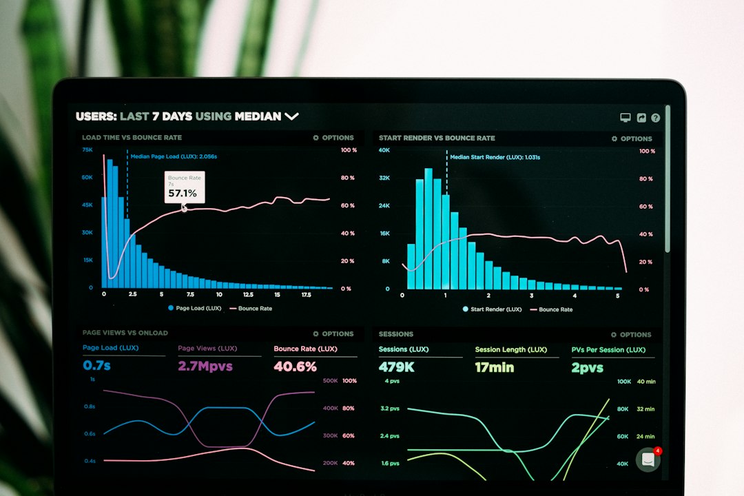
Best Practices for Advanced Reporting
Advanced reporting is only valuable when it is trusted and used consistently. The following best practices help organizations build reporting systems that are practical, scalable, and meaningful.
- Start with business objectives: Reports should be tied to specific goals, such as increasing revenue, reducing churn, improving customer satisfaction, or lowering operational costs.
- Define metrics clearly: Every KPI should have a documented definition, formula, data source, owner, and reporting frequency. This prevents teams from debating numbers instead of acting on them.
- Prioritize quality over quantity: A dashboard with 12 meaningful metrics is usually more useful than one with 60 disconnected charts.
- Segment data intelligently: Data becomes more actionable when organized by region, product, customer type, campaign, department, or time period.
- Use consistent visual language: Colors, labels, chart types, and naming conventions should remain consistent across reports to reduce confusion.
- Automate recurring reports: Automation saves time, reduces manual errors, and ensures stakeholders receive timely updates.
- Review reports regularly: KPIs should evolve as strategies change. Metrics that no longer support decisions should be removed or replaced.
Choosing the Right KPIs
A KPI is not just any metric. It is a measurable indicator of progress toward an important business outcome. Advanced reporting requires a balanced mix of leading indicators, which predict future performance, and lagging indicators, which show results that have already occurred.
For example, monthly revenue is a lagging indicator, while sales pipeline value is a leading indicator. Customer churn is a lagging indicator, while support ticket volume or declining product usage may be leading indicators. A strong reporting framework includes both types so teams can measure outcomes and manage the behaviors that influence those outcomes.
Common KPI Categories
- Financial KPIs: Revenue growth, gross margin, operating profit, cash flow, customer acquisition cost, and return on investment.
- Sales KPIs: Lead conversion rate, sales cycle length, average deal size, win rate, pipeline value, and quota attainment.
- Marketing KPIs: Website conversion rate, campaign ROI, cost per lead, engagement rate, organic traffic, and marketing qualified leads.
- Customer KPIs: Net promoter score, customer satisfaction score, churn rate, retention rate, customer lifetime value, and support resolution time.
- Operational KPIs: Productivity, fulfillment time, defect rate, utilization rate, on-time delivery, and process cost.
The best KPI set is not universal. It depends on the organization’s strategy, maturity, industry, and decision-making needs. An early-stage company may focus heavily on acquisition and cash flow, while an established enterprise may prioritize efficiency, retention, and profitability.
Dashboard Design Principles
Dashboards are the visual layer of advanced reporting. Their purpose is not decoration; their purpose is understanding. A well-designed dashboard directs attention to the most important information and makes the next step easier to identify.
Effective dashboards usually follow a simple hierarchy. The most important KPIs appear at the top, trends and comparisons sit in the middle, and supporting details appear lower down. This structure helps executives scan quickly while still allowing analysts and managers to investigate performance in greater depth.
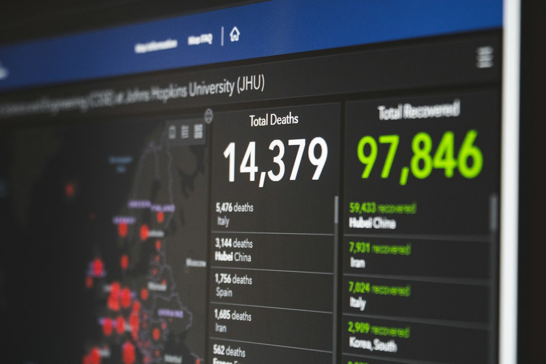
Visual selection also matters. Line charts work well for trends over time. Bar charts are useful for comparing categories. Scorecards highlight headline metrics. Heat maps reveal patterns across segments. Tables should be used carefully and only when precise values are necessary.
Clarity is more important than complexity. Too many filters, colors, labels, and chart types can make a dashboard harder to use. The best dashboards often look simple because the strategic thinking behind them is strong.
Dashboard Examples by Business Function
Executive Performance Dashboard
An executive dashboard offers a high-level overview of organizational health. It may include revenue, profit margin, cash position, growth rate, customer retention, employee headcount, and strategic project progress. This dashboard should highlight exceptions, risks, and trends rather than operational detail.
Sales Dashboard
A sales dashboard helps leaders monitor pipeline quality and team performance. Useful elements include total pipeline value, win rate, forecasted revenue, average deal size, sales cycle length, top opportunities, and rep-level quota attainment. Advanced versions may include predictive forecasting and deal risk scoring.
Marketing Dashboard
A marketing dashboard connects campaign activity to measurable outcomes. It may show traffic sources, lead volume, conversion rates, campaign ROI, customer acquisition cost, and funnel movement. The strongest marketing dashboards link engagement metrics to revenue rather than reporting vanity metrics in isolation.
Customer Support Dashboard
A support dashboard focuses on service quality and customer experience. Common KPIs include ticket volume, first response time, resolution time, backlog, customer satisfaction, escalation rate, and recurring issue categories. This type of dashboard helps managers allocate resources and identify product or process weaknesses.
Common Reporting Mistakes to Avoid
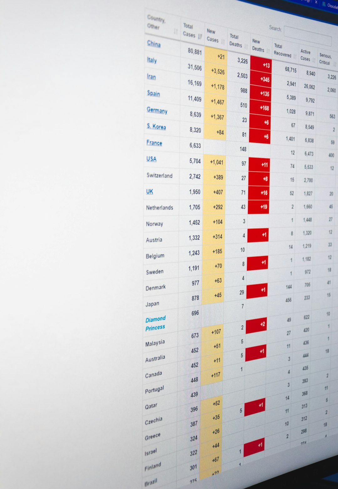
Even well-funded reporting initiatives can fail if the structure is weak. One common mistake is building reports around available data rather than important questions. Another is creating dashboards for everyone at once, which often results in vague reports that serve no audience well.
Organizations should also avoid overloading dashboards with decorative visuals. Attractive charts are useful only when they communicate insight clearly. In addition, reports should not rely on unverified data sources or inconsistent formulas. If stakeholders lose confidence in the numbers, adoption quickly declines.
Finally, advanced reporting should not end with observation. A report that shows declining retention should lead to investigation, ownership, and corrective action. The ultimate value of reporting is not the dashboard itself, but the decisions and improvements it enables.
Building a Reporting Culture
Technology alone cannot create a strong reporting environment. Organizations also need a culture that values data literacy, accountability, and transparency. Teams should understand what KPIs mean, how they are calculated, and how their work influences results.
Regular review meetings can help connect reporting to action. During these sessions, leaders should discuss what changed, why it changed, what will be done next, and who is responsible. Over time, this rhythm helps transform dashboards from passive displays into active management tools.
FAQ
-
What is advanced reporting?
Advanced reporting is the use of integrated data, defined KPIs, dashboards, automation, and analysis techniques to provide deeper business insight than basic reports. -
How many KPIs should a dashboard include?
Most dashboards work best with a focused set of key metrics, often between 5 and 15, depending on the audience and purpose. -
What is the difference between a metric and a KPI?
A metric measures activity or performance, while a KPI measures progress toward a specific strategic objective. -
How often should dashboards be updated?
Update frequency should match decision needs. Operational dashboards may update daily or hourly, while executive dashboards may update weekly or monthly. -
What makes a dashboard effective?
An effective dashboard is accurate, easy to read, role specific, visually clear, and directly connected to decisions or actions.