Pick Lucide for clean product UI, Heroicons for Tailwind-heavy apps, and Tabler Icons when you need a huge set without visual noise. If your team needs broader coverage, add Phosphor, Material Symbols, Feather, or Bootstrap Icons to the shortlist. Google’s Material Symbols offers more than 2,500 icons, which shows how large modern icon sets have become [source: Google Fonts].
TLDR: For most web apps, Lucide Icons is the safest all-round choice because it is sharp, simple, and easy to customize. Heroicons is great for Tailwind projects, while Tabler Icons wins when you need lots of icons fast. For example, a SaaS dashboard with 120 interface actions could use Lucide for 90% of its UI, then switch to Tabler only when it needs niche icons like medical tools, crypto symbols, or sport items.
Why icon consistency matters
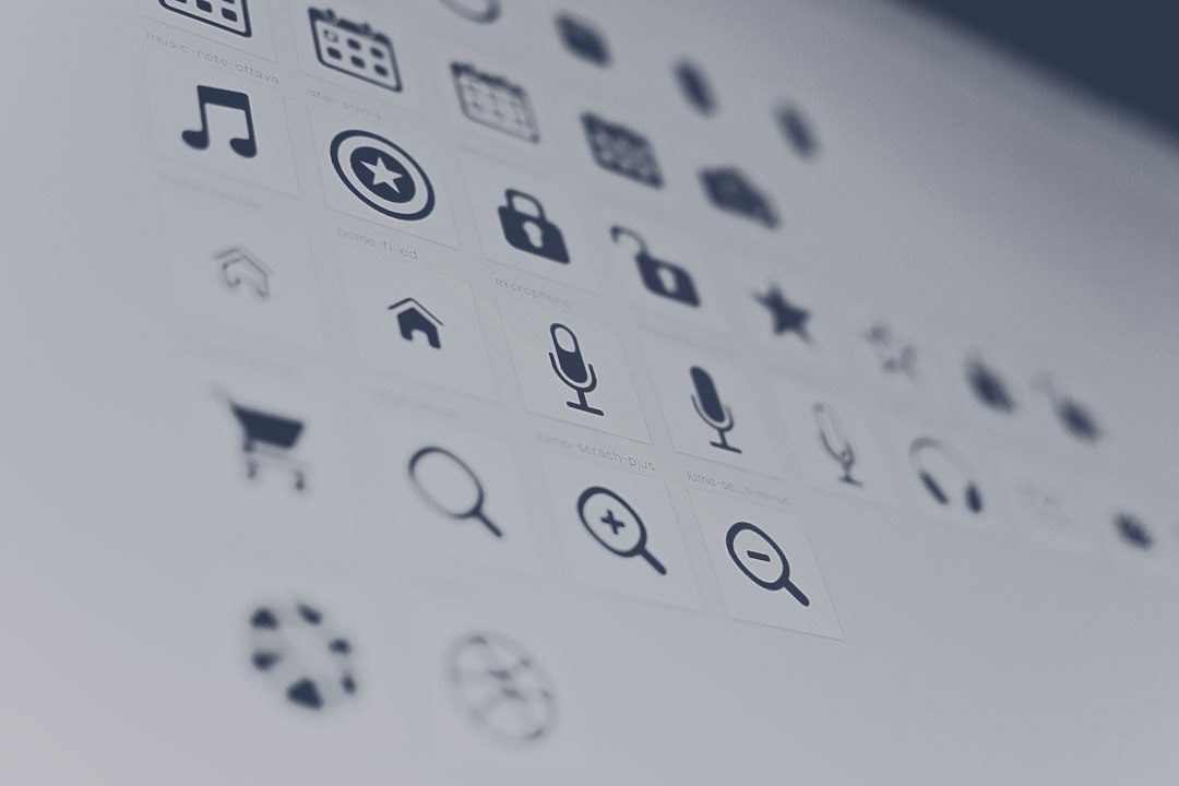
Icons seem small. Then your app starts to feel messy. One icon has rounded corners. Another has sharp corners. One stroke is 1.5px. Another feels chunky. Suddenly the interface looks patched together.
That tiny mismatch can make a product feel less polished. It also slows teams down. Designers spend time fixing icon weights. Developers hunt for missing SVGs. Honestly, it feels like a silly way to lose 20 minutes during a regular UI task.
A good icon library should give you:
- A consistent stroke style across the full set.
- SVG and component support for modern front-end stacks.
- Enough icons for common interface needs.
- Clear licensing for commercial projects.
- Easy customization for size, color, and stroke width.
1. Lucide Icons: the clean default for modern apps
Lucide is a community-built fork of Feather Icons. It keeps the same thin, friendly line style but adds a much larger icon set. It works well for dashboards, SaaS tools, admin panels, mobile apps, and landing pages.
The best part is control. You can change size, color, and stroke width without fighting the icon. Lucide also has packages for React, Vue, Svelte, Angular, and plain SVG use.
Best for: product interfaces, design systems, developer tools, analytics apps.
Watch out for: some icons can feel too light if your UI uses bold typography or dense spacing.
2. Heroicons: best friend of Tailwind users
Heroicons comes from the team behind Tailwind CSS. That alone makes it popular with front-end developers. The set includes outline and solid versions, which is handy for states like inactive and active menu items.
Heroicons feels simple, direct, and very usable. It is not the largest set, but it covers most interface basics: arrows, menus, user actions, charts, alerts, and layout controls.
Best for: Tailwind CSS projects, startups, marketing dashboards, simple admin screens.
Watch out for: you may hit limits if your product needs many niche icons. Expect to waste time on substitutes if your app has complex categories.
3. Tabler Icons: huge set, clean style
Tabler Icons is one of the most useful open-source icon sets for interface design. It has a massive range and still keeps a clean outline style. That makes it a strong choice for teams that need both common UI icons and specific symbols.
Need icons for weather, health, maps, charts, payments, sports, devices, or social platforms? Tabler probably has them. The style is not as delicate as Lucide, but it is very readable.
Best for: large apps, admin products, data tools, marketplaces, internal platforms.
Watch out for: with so many options, designers can pick similar icons for the same action. Set rules early.

4. Feather Icons: minimal but smaller
Feather Icons helped make thin outline icons popular. The set is simple, elegant, and easy to read. It still looks good today.
The issue is size. Feather has fewer icons than Lucide or Tabler, so it may feel tight for larger products. Still, it is a good fit for small websites and portfolios.
Best for: personal sites, clean landing pages, small apps.
Watch out for: missing icons. You may need another set sooner than planned.
5. Phosphor Icons: flexible and expressive
Phosphor Icons stands out because it offers multiple weights, including thin, light, regular, bold, fill, and duotone. This gives teams more visual range without leaving the same family.
It works well when your interface needs personality. A fintech app might use regular icons in tables, then bold or filled icons for empty states and feature cards.
Best for: consumer apps, mobile UI, brand-heavy products, onboarding screens.
Watch out for: too many weights can create inconsistency if the team has no rules.
6. Material Symbols: broad and practical
Material Symbols is Google’s icon system. It has strong coverage and works well if you follow Material Design patterns. The set includes outlined, rounded, sharp, and filled styles, so it can fit many Android and web projects.
It is practical, not trendy. That is a good thing for enterprise UI, internal tools, and apps that need familiar symbols.
Best for: Android apps, Google-style interfaces, enterprise tools.
Watch out for: the style can feel generic if your brand needs a distinct look.
7. Bootstrap Icons: solid choice for Bootstrap projects
Bootstrap Icons is useful even outside Bootstrap. The icons are clear, readable, and free to use. They match Bootstrap components well, so buttons, alerts, forms, and nav bars feel natural.
If your team already uses Bootstrap, this set saves time. It also reduces the risk of odd spacing or mismatched visual weight.
Best for: Bootstrap websites, business apps, quick prototypes, admin panels.
Watch out for: it may not feel as refined as Lucide or Heroicons in custom design systems.
Quick comparison
- Best all-rounder: Lucide Icons.
- Best for Tailwind: Heroicons.
- Best large set: Tabler Icons.
- Best minimalist set: Feather Icons.
- Best style variety: Phosphor Icons.
- Best for Material Design: Material Symbols.
- Best for Bootstrap: Bootstrap Icons.
How to choose the right one
Start with your product type. A dense B2B dashboard needs clarity, so Lucide or Tabler makes sense. A simple Tailwind app can use Heroicons and move fast. A consumer mobile app may benefit from Phosphor because it has more warmth.
Then check coverage. List your top 50 interface actions: search, edit, delete, filter, export, upload, lock, user, settings, chart, warning, and so on. If the library covers at least 45 without awkward substitutes, it is probably safe.
Finally, set rules. Pick one stroke width. Pick one style. Do not mix outline, filled, rounded, and sharp icons without a reason. Icons are tiny, but users notice when they feel wrong.
Final pick: use Lucide if you want a clean default, Heroicons if you live in Tailwind, and Tabler if your app needs a deep icon catalog. The right library is the one your team can use every day without fixing tiny visual problems over and over.